A few weeks in, Data Science thoughts on COVID-19 in SA
Dr Vukosi Marivate, ABSA UP Chair of Data Science, Data Science for Social Impact Research Group.
I started writing this post on my thoughts on Data Science and COVID-19 in South Africa while also co-organising and assisting at the International Conference of Learning Representations workshops on African Natural Language Processing (AfricaNLP) and Practical Machine Learning for Developing Countries (PML4DC). The topics being covered in both workshops are my passions. I have a large interest in Natural Language Processing and Data Science for Society. These two topics have many things in common, but ultimately we deal with data and pipelines to bring potential reality solutions to the problems we face. In the last few weeks, lots of professionals hands have been on deck due to the spread of COVID -19 around the continent.
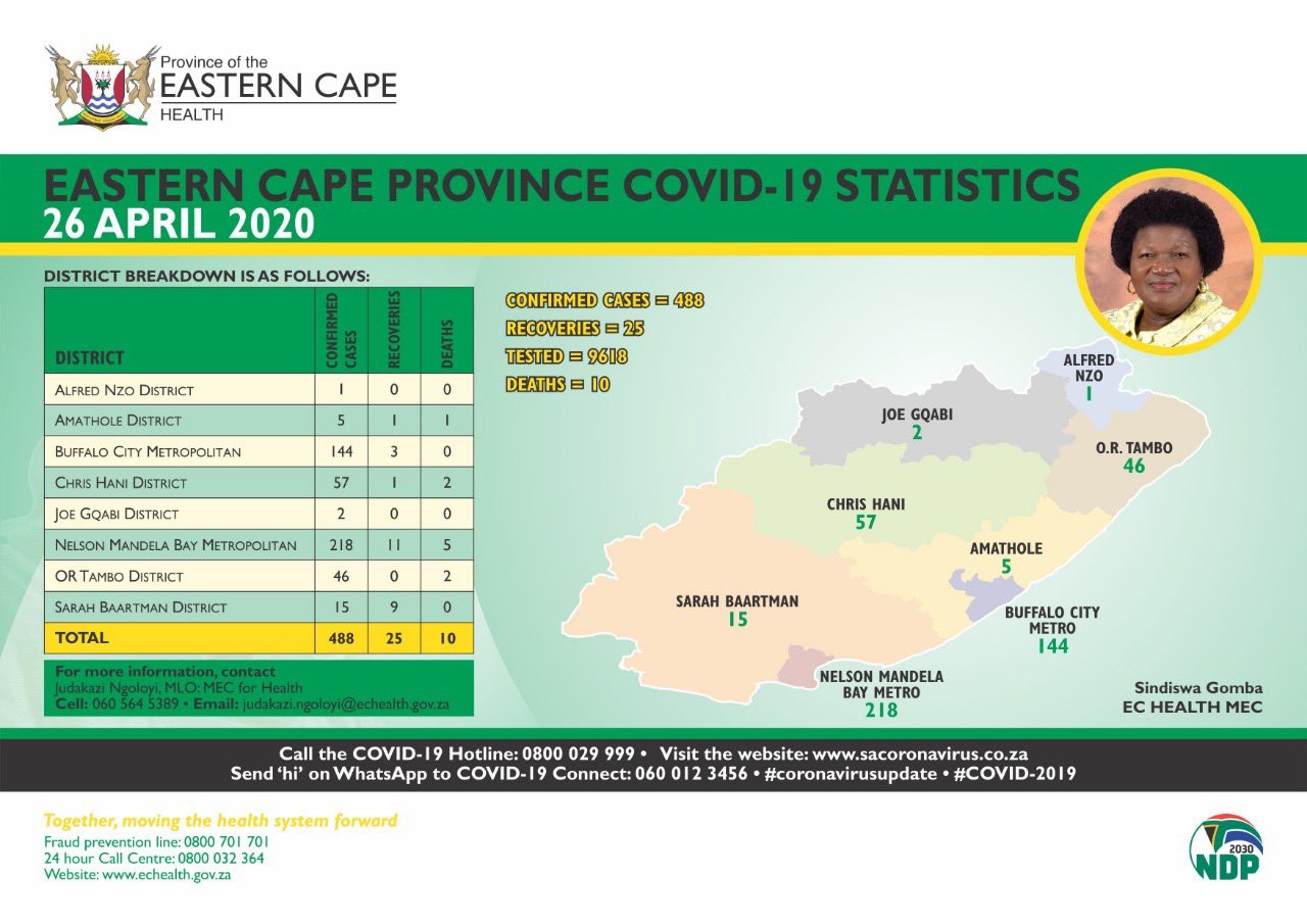
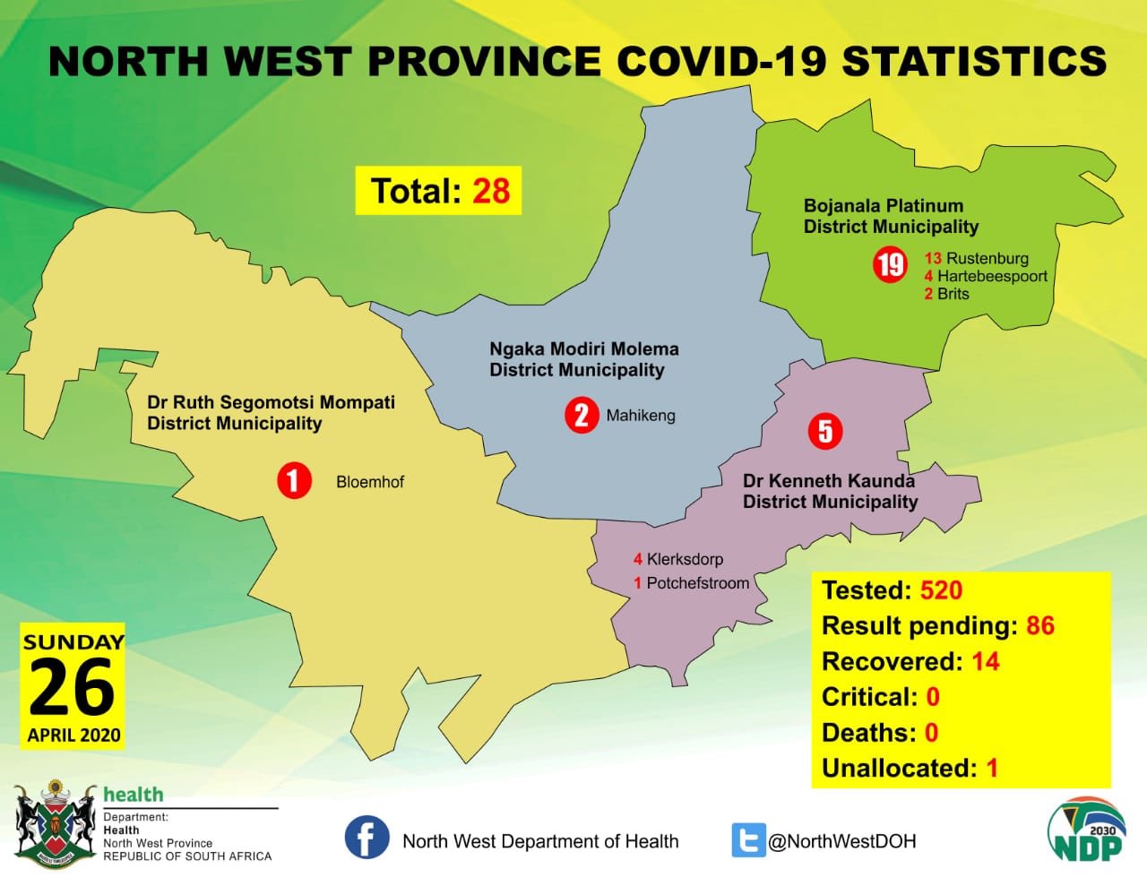
Infographics aren’t data!!!
We made a call with our blogpost announcing the covid19za and covid19africa data repositories for more open data on the spread of the pandemic in South Africa and the African continent. We highlighted in our first paper the challenge with having to extract data from public ministry statements to build up machine-readable data. Also, we developed a large chunk of work to extract meaningful information from infographics, and as part of sharing information with many of the provinces, we have seen the proliferation infographics summarising in the current case data as follows:
Eastern Cape
North West
The NICD does this as well.
NICD
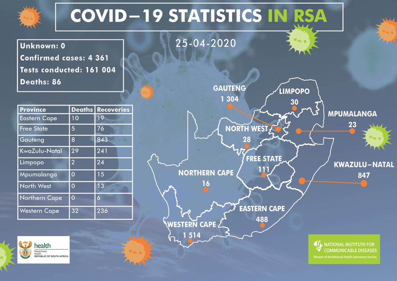
Infographics are graphic visual representations of information, but no textual data is involved, and one of the most notable challenges about this pandemic is inaccessible accessible to open data. It would, therefore, be desirable for all provinces and national government to have a seamless page related to health and COVID-19 and health that is machine-readable by scientists for analysis the inclination of the disease to decontaminate the fear in the public domain. The infographics have added just a hurdle in getting to this.
What data do we capture?
In South African, the below are the current repository data we have:
- District Level Case Data,
- Provincial Level Case Data,
- Provincial Level Death Data,
- National Testing, Case and Death Data,
- Health Systems Data.
For most of these data, the aims are to get them updated daily. Right now, a legion of volunteers is working on reading different infographics to present information quickly, clearly and update repository. We have heard from many analysts who have informed us that they now use the covid19za data repository as their favoured source of data for analytics.
These demonstrate the necessity for open, machine-readable data and looking at the effect of social distance measure (see this paper) to contain the pandemic and reduce the total collapse of health systems. In this blog, we need to learn the capacity of our local hospitals/clinics? In other words, how many free beds, ICU, isolation, and high care wards are available? What is the competency of health professional per hospital? What is the velocity of screening and testing locally? This data should be available in real-time. For example, Germany makes it possible to see information about each public hospital in real-time: https://coronavis.dbvis.de/en/. Without this information, we do not know where we should be putting resources or offering support. We then would be driving in the dark. In the best case, the grey areas of data indicate sharing protocols by the various departments, while in the worst scenario, it means some departments do not have a clear view of their internal data (and this would scare us all).
Calculating the realtime reproduction rate
There is a great set of notebooks from Kevin Systrom that cover calculating the realtime reproduction rate for COVID-19 for USA states. The first approach employs a Bayesian approach, while the other method applied Markov chain Monte Carlo (MCMC). Therefore, in this blog, we adapted the bayesian notebook on South Africa data in our repository (see: Realtime R0 South Africa). First let us look at the growth of the predicaments in SA, as depicted in the smoothed graph below:
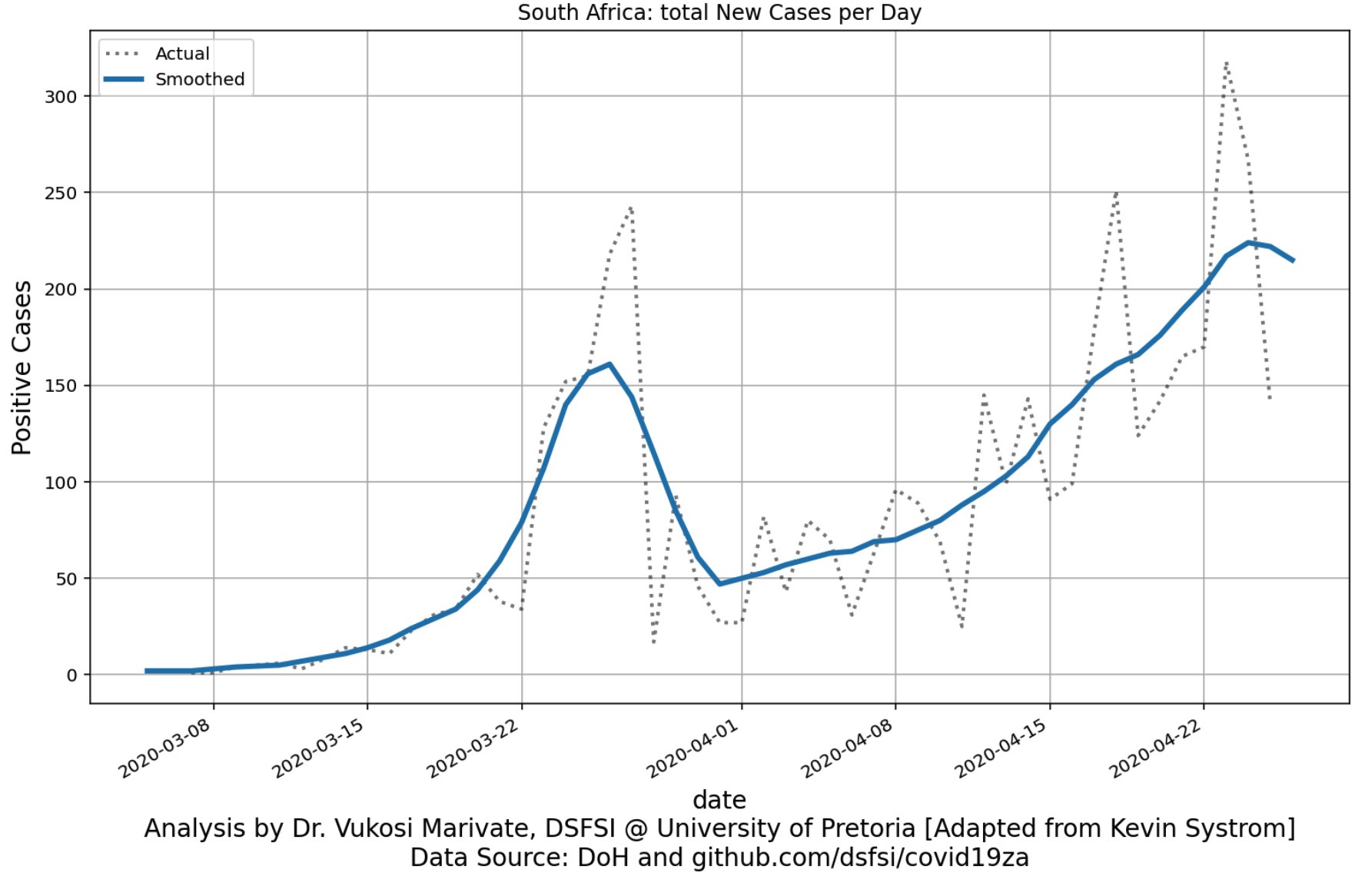
Thus, what is the story? We can see the influence of the travel ban and lockdown. However, after a little while, the rate of infections started to increase due to inadequate screening and testing ability. With that, let’s look at the total realtime Rt (reproduction rate for the whole country).

To understand the reproduction rate for the whole country, we must finally have a look at all the provinces and their individual Rt values.

The inferences above paint a realistic picture of how the pandemic is growing in South Africa. You can see the very steep decline just after lockdown and then the gradual increases after lockdown had come in effect. This paints a clear picture of the different battles being waged in the provinces to keep this spread of the COVID-19 disease under control. We still have a while to go and what will become important as time continues, is getting more public testing information. How each province tests is vital in us knowing if we can compare apples to apples or we are comparing apples and oranges. See this great write up on Our World in Data that talks and shows visualisations about testing and COVID-19 across countries. We need to test more period. However, we also need to release our testing and screening information publicly, so we can evaluate what is going on.
Things to share
- We have a preprint for looking at local language data collection and curation. We use news headlines from South African radio stations as a data source. We annotate the data by adding categories to the headlines and then training models to predict the categories. [side note: we are looking to work with South African partners who have local language text data that can be categorised like news, books etc., get in touch] Arxiv: https://arxiv.org/abs/2003.04986
- We also have a paper in review building on our work in 2019 with DSTI Sierra Leone in developing ML models to predict school performance in SA and in Sierra Leone. DSTI Sierra Leone has been a great partner and it allows us to learn the critical step of interacting with a decision-maker and also look at creating values both ways. Arxiv: http://arxiv.org/abs/2004.11369
- You can keep up with the covid19za work we are doing on this page - https://dsfsi.github.io/blog/covida19za-shared/. We have a video of my talk at the Deep Learning IndabaX 2020 talking through the project.
Acknowledgements
There are many people who have come together on this small project to collect and collate data. We also acknowledge the hard work of public servants who are crunching data across the country and continent. We will always be here for you to assist where we can.
Github Issue Comments
Thank you for some many who have made comments and shared their ideas on the issue page https://github.com/dsfsi/covid19za/issues
Github Contributors
Full contributors https://github.com/dsfsi/covid19za/graphs/contributors